Gaia Collective
Simplifying sustainable shopping through curation and transparency
My Role
UX/UI Designer
Timeline
10 Days
Team
Solo Project
Tools
Figma
Final Design
A "Curated for conscious living" hero, bestsellers, smart shopping modules, and clear category navigation to help parents quickly find relevant products.
Homepage Experience
Complete homepage showcasing "Curated for conscious living" hero, bestsellers, smart shopping features, and category navigation.
About & Criteria
Brand story, transparent criteria (Responsible Selection, Transparency, Safety, Effectiveness), Cost-Per-Use explanation, and curation process.
Product Page
Safety badges, detailed product info, customer reviews, and "Why it's worth it" section with cost-per-use breakdown.
Shopping Cart
Cart summary with safety badges (Gaia's Pick, Kids Safe, Refillable), quantity controls, and "Complete Your Eco Swap" personalized recommendations.
Checkout Flow
Guest checkout option with progress indicator, contact/delivery forms, secure payment section, and order summary with discount code field.
The Challenge
Eco-conscious parents want to make better choices, but the current experience is overwhelming, vague, and uncertain.
From research with 12 household shoppers, a common pattern emerged: they open multiple tabs, read labels and reviews, and still feel unsure. On average, they spent 45+ minutes deciding, then often fell back on familiar brands "just to be safe."
The challenge wasn't only information architecture. The interface itself needed to signal safety, transparency, and value so parents could trust their choices without doing extra homework.
Design Question
How might we help eco-conscious parents make confident, time-efficient product purchases without feeling overwhelmed by greenwashing or questioning whether the extra price is justified?
Research Insights
Safety Over Savings
Parents prioritize knowing products are safe for kids and pets over price considerations.
"Kids-Safe and Pet-Safe will be more valuable for me... Price is my second priority."— Usability Test Participant 2
Information Overload
Too many certifications and eco-labels create decision paralysis rather than confidence.
"I see all these badges but I don't know which ones actually matter for my family."— Interview Participant 5
Need for Curation
Parents want expert curation to cut through marketplace noise and simplify decisions.
"I just want someone to tell me: This is the safe choice for busy parents."— Interview Participant 3
From Research to Design
Here's how specific insights from competitive analysis and user testing directly shaped key design decisions.
Research Finding
Competitive analysis revealed most eco-marketplaces bury safety and ingredient info deep in product descriptions or separate tabs.
Design Decision
Made safety badges (Kids Safe, Pet Safe, Refillable) primary visual elements on product cards and PDPs, scannable at first glance without clicking or scrolling.
Research Finding
User interviews revealed decision fatigue from too many eco certifications and confusing sustainability claims across competitor sites.
Design Decision
Limited to 2-3 trust signals per product maximum. Created "Gaia's Pick" as the single authoritative curation badge that parents could trust without researching individual certifications.
Research Finding
From user research: "I see the higher price tag and assume it's just bougie marketing. I need to know if it's actually worth it."
Design Decision
Created "Why it's worth it" section on PDPs with cost-per-use breakdown showing long-term value vs. conventional alternatives (e.g., "$0.15 per wash vs. $0.45 for standard detergent").
Design System
The visual system is designed to reduce cognitive load, build trust, and differentiate Gaia Collective from competitors.
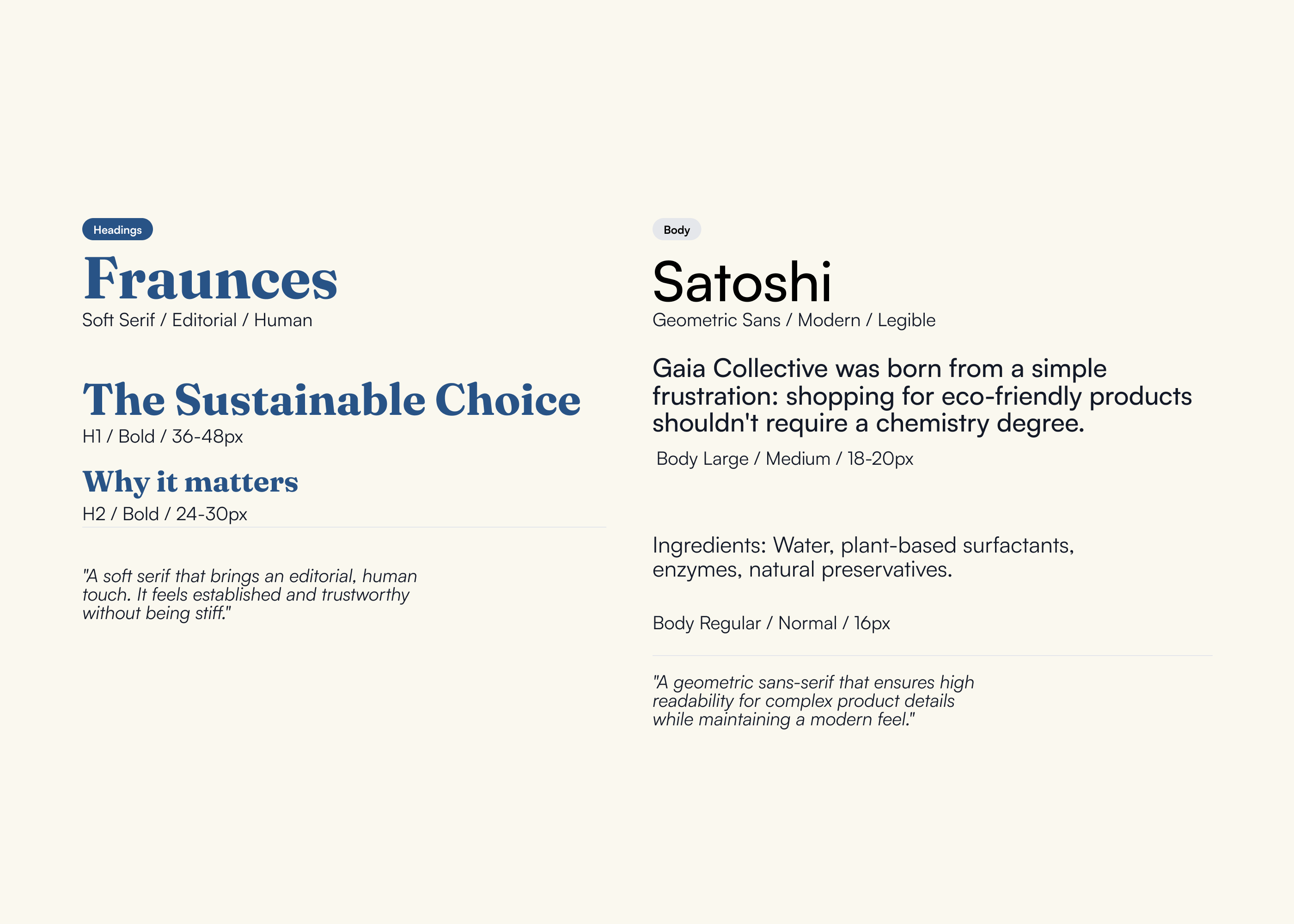
Typography
Fraunces (serif) for headings signals "we take this seriously" while Satoshi (sans-serif) for body text ensures "we make this easy." The pairing avoids two extremes: not too delicate or precious, not too cold or clinical.
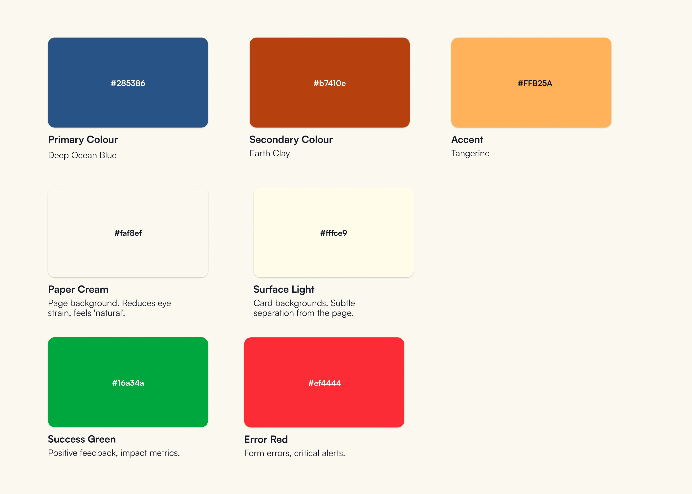
Color System
Gaia Collective uses Deep Ocean Blue and Earth Clay to stand out while remaining eco-aligned and recognizable.
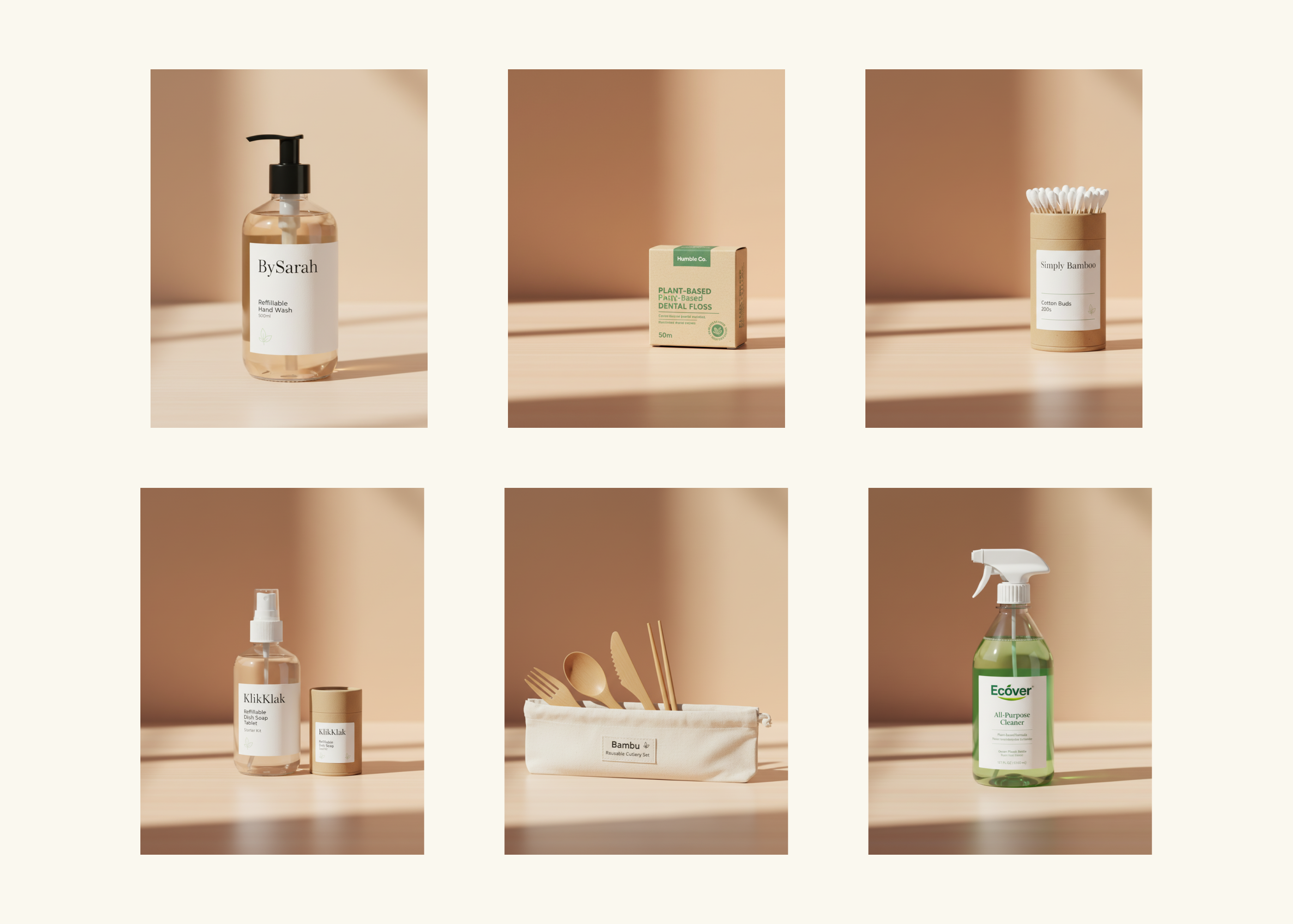
Photography Style
Clean product shots on consistent warm beige / neutral backgrounds. Minimal props and no busy lifestyle scenes that compete for attention. Parents can quickly understand what they're buying.
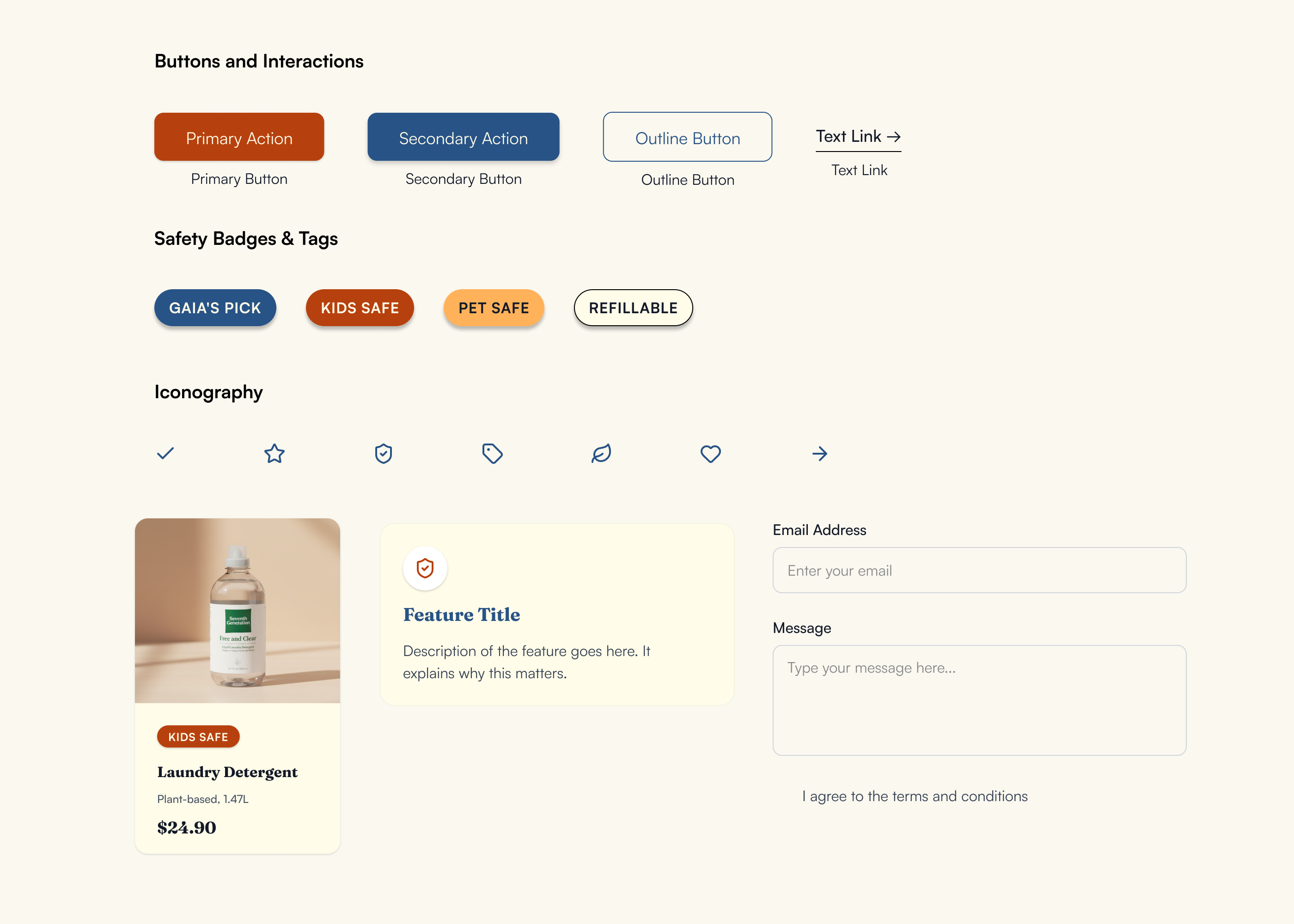
Core Components
Clear hierarchy of button styles, consistent safety badges with icons, and reusable cards. All components minimize mental effort: users learn the patterns once and apply them across the site.
Key UI Solutions
Safety Badge System
Research Insight
"Kids-Safe and Pet-Safe will be more valuable for me... Price is my second priority."— Usability Test Participant 2
Problem
Parents cared deeply about safety, but in the initial designs, safety signals blended into the product image and were often missed. In testing, 3/5 participants didn't notice the badges until prompted.
Design Changes
- •Increased visual weight of safety badges
- •Moved badges outside the product image area to avoid clutter
Result
After iteration, 5/5 participants noticed the safety badges without prompts and used them as a primary scan point when choosing products for their family.
Product Card Hierarchy
Research Insight
"Parents wanted to know 'Is it safe?' first, then check price and value, then look at social proof."— User Testing Finding
Problem
Early product cards tried to show too much: multiple badges, labels, and pricing details, which overwhelmed users.
Design Changes
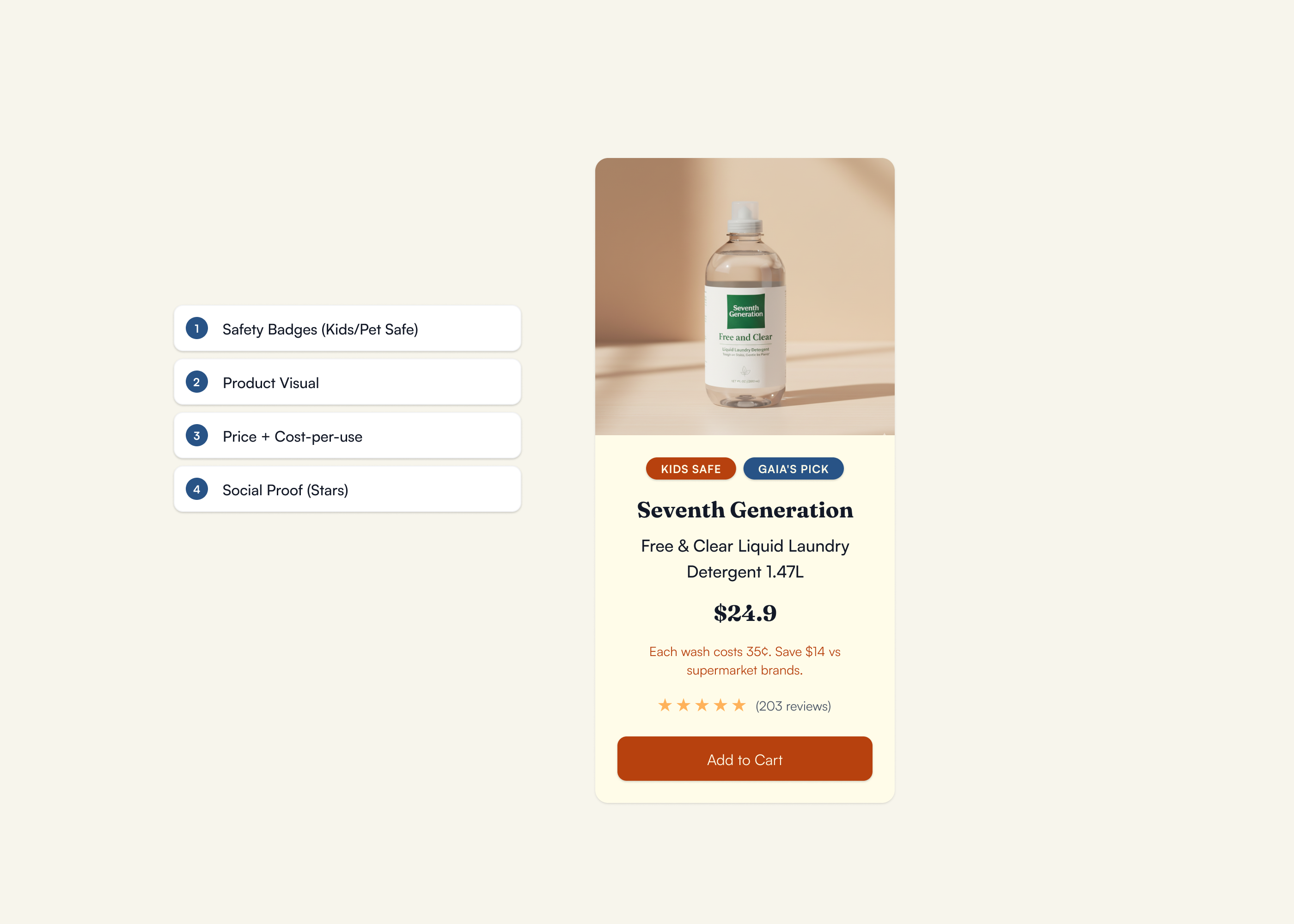
Established a research-validated hierarchy:
- Safety Badges (Kids/Pet Safe) — Most important scan point
- Product Visual — Visual confirmation
- Price + Cost-per-use — Value justification
- Social Proof (Stars) — Trust signals
Result
Users scanned cards left to right and top to bottom in a more consistent way, and were able to explain why they would pick one product over another in clearer terms (safety → value → reviews).
Curated Selection
Research Insight
"I just want someone to tell me: This is the safe choice for busy parents."— Interview Participant 3
Problem
Endless choice leads to decision fatigue. Parents wanted someone to "pre-filter" the noise.
Design Changes
- •Limited each category to 15–20 curated products rather than a full catalog
- •Introduced a clear "Gaia's Pick" label for standout options
- •Framed copy around "curated for busy parents" instead of generic "recommended products"
Result
Participants described the experience as feeling "edited" and "less overwhelming." Several said they would start with Gaia's Picks to save time rather than filtering everything themselves.
What I Learned
Usability testing with 5 participants revealed what worked, what didn't, and where the design needed to evolve.
Checkout Completion
Under 60 seconds
Trust & Confidence
In site credibility
Badge Visibility
Post-iteration
Safety Badges
Problem
Safety badges blended into the product image area. In initial testing, 3 out of 5 participants completely missed the badges until specifically prompted to look for safety information.
What I Changed
- •Repositioned badges as primary scan anchors outside the product image
- •Increased visual weight with bold borders and contrasting colors
- •Added icons for faster visual processing
Result
Post-iteration, 5 out of 5 participants noticed badges immediately without prompting. One participant said: "Oh, I love that these are right here—I don't have to hunt for it."
Cost-Per-Use Discovery
Problem
Cost-per-use information was completely undiscoverable. 0 out of 5 participants noticed it unprompted, even though it directly addressed their value concerns.
What I Would Change
- •Move cost-per-use calculation higher on PDP, potentially as a callout near the price
- •Test making it part of a comparison/decision module on product cards
- •Consider progressive disclosure: show basic CPU on card, expand details on PDP
Key Learning
Value information needs to live where price anxiety happens—right next to the price tag, not buried in descriptions. The 10-day timeline didn't allow for a second round of iteration and testing, but this would be my first priority in v2.
Broader Takeaways
- →Test early and test often. The safety badge issue was invisible to me as the designer but glaringly obvious in testing. User feedback caught it before launch.
- →Prioritize based on user decision sequence. Parents look for safety first, then value, then social proof. The interface hierarchy needs to match that mental model.
- →Document what you can't fix now. The cost-per-use discovery issue didn't get solved in v1, but documenting it ensures it's addressed in future iterations rather than forgotten.
Outcomes
Although Gaia Collective is a conceptual project, usability testing showed meaningful improvements after iteration:
Participants noticed and used safety badges in their decision-making
Curated selections reduced perceived effort: parents described the site as "helpful" and "reassuring"
Participants described the experience as feeling "edited" and "less overwhelming." Several said they would start with Gaia's Picks to save time rather than filtering everything themselves.
Explore the Prototype
Walk through the full shopping flow – from homepage to checkout – to see how safety signals, cost transparency, and curated selection come together in the final design.
View Prototype →"Your prototype was nicely executed with good use of color, spacing, and Figma features. Testing was thorough and well organized, and your iterations showed clear improvements based on feedback. Your delivery was confident and steady, and you explained your design process well. This was a thoughtful and well-structured project."
UX Design Instructor
General Assembly
Want to see more?
Explore other projects or get in touch to discuss your next design challenge.